COCHIN
A series of informational posters designed for the typeface Cochin. I used a playful approach for this due to the energising vibe it gives out.
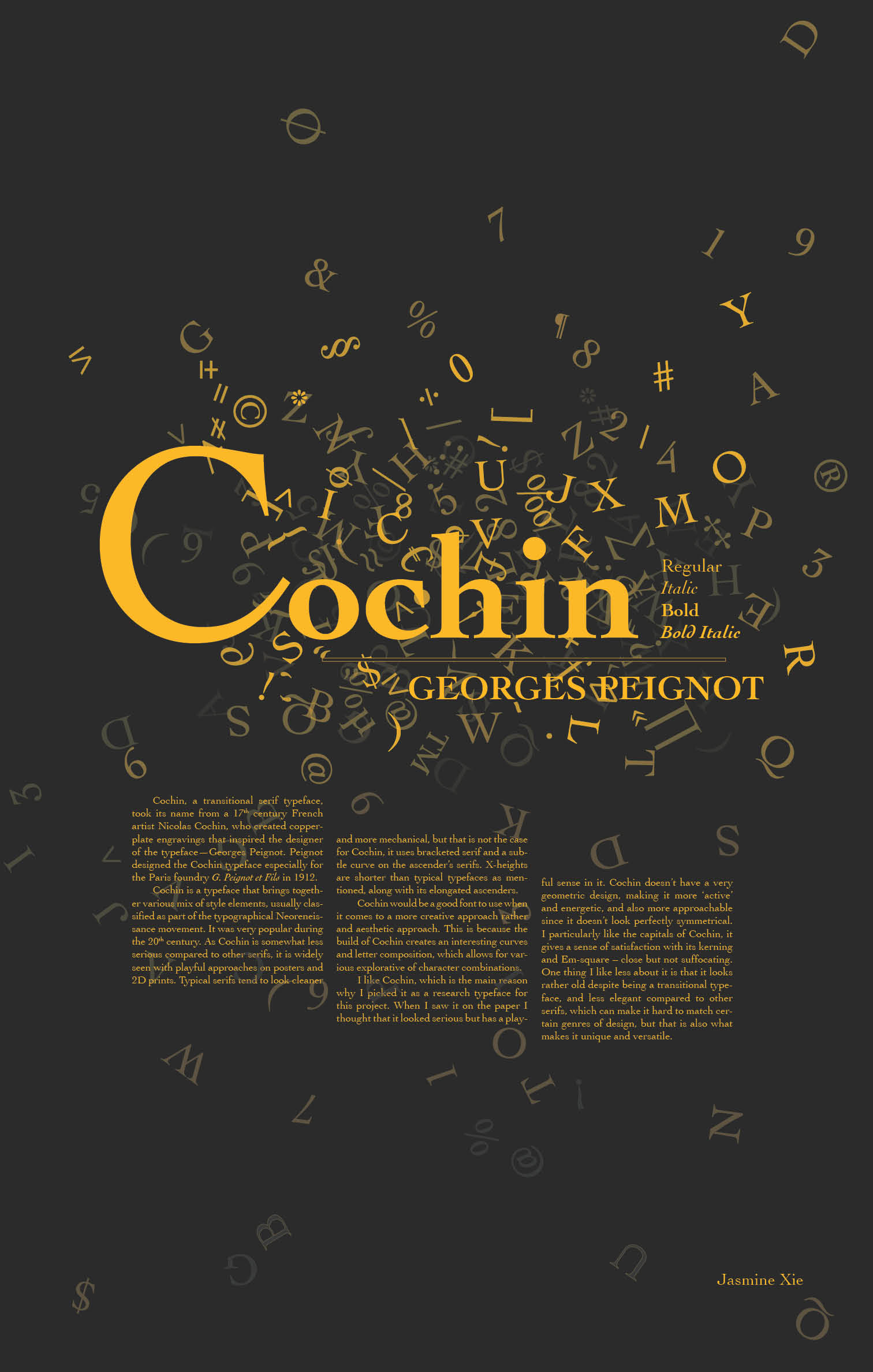
Cochin is a typeface that brings together various mix of style elements, usually classified as part of the typographical Neoreneissance movement. It was very popular during the 20th century, and hence widely used and seen in public. As Cochin is a somewhat less serious typeface compared to other serifs, it is widely seen with playful approaches on posters and 2D prints. Typical serifs tend to look cleaner and more mechanical, but that is not the case for Cochin. It uses brackets serif and has a very subtle curve on the ascender’s serifs. X-heights are shorter than typical typefaces as mentioned, along with its elongated ascenders.
Fun fact: the Cochin typeface was used as the cover font for Harry Potter novels published by Bloomsbury Publishing. The logo of Dior is also designed with a typeface very similar to Cochin, along with movie The Longest Ride’s poster typeface.