DR. LINK

Dr. Link is a group project aimed to simplify and make communications between the elder, their family members, and their health provider more efficient. Its primary purpose is to organise information that may be hard to find or understand (eg. health records, clinical reports) into digestible bits for both the elder and their family. We focus on designing interfaces that encourages both parties to facilitate more conversation and information sharing, while also designing for a more accessible, convenient platform for elders.
DESIGN CHALLENGE
As the age of technology emerges, it brings forth a lot of convenience to people’s lives, but it can also make people’s life more complicated. A lot of seniors struggle with using new technologies, and rather use traditional ways such as memory and note taking to remind themselves with important things, including medication intake and doctor appointments, and this may not always be the most reliable way.
DESIGN GOALS

Our project focuses on creating a seamless platform that connects doctors, senior patients, and their family members by directly linking them to each other through the sharing of data and resources. This platform will be presented in the form of an app, Dr. Link, where we target user groups that uses smartphone on a daily basis.
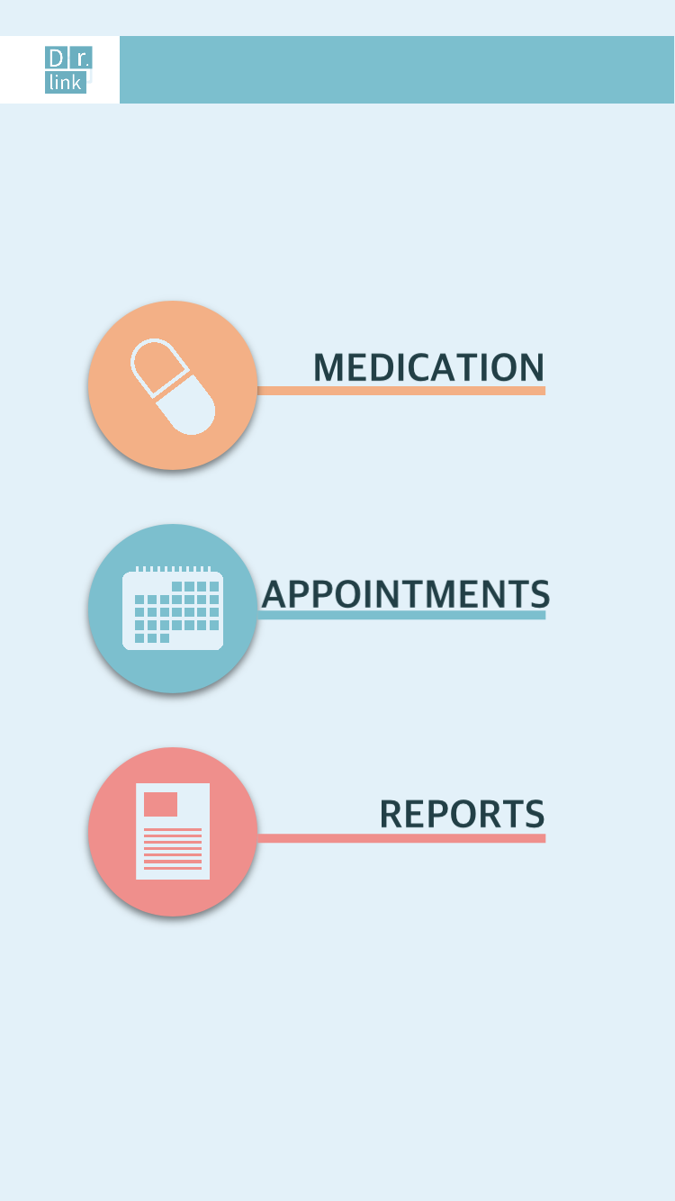
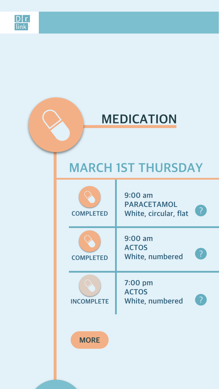
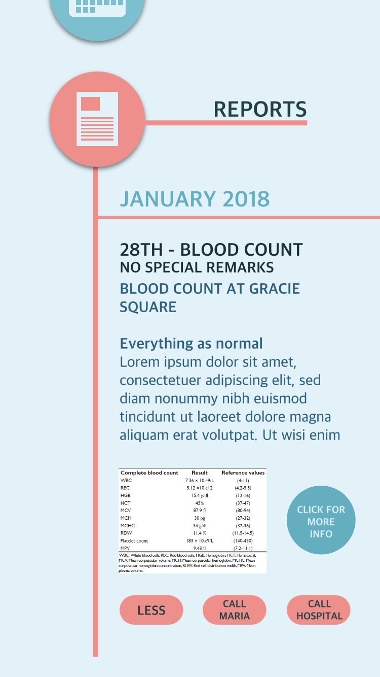
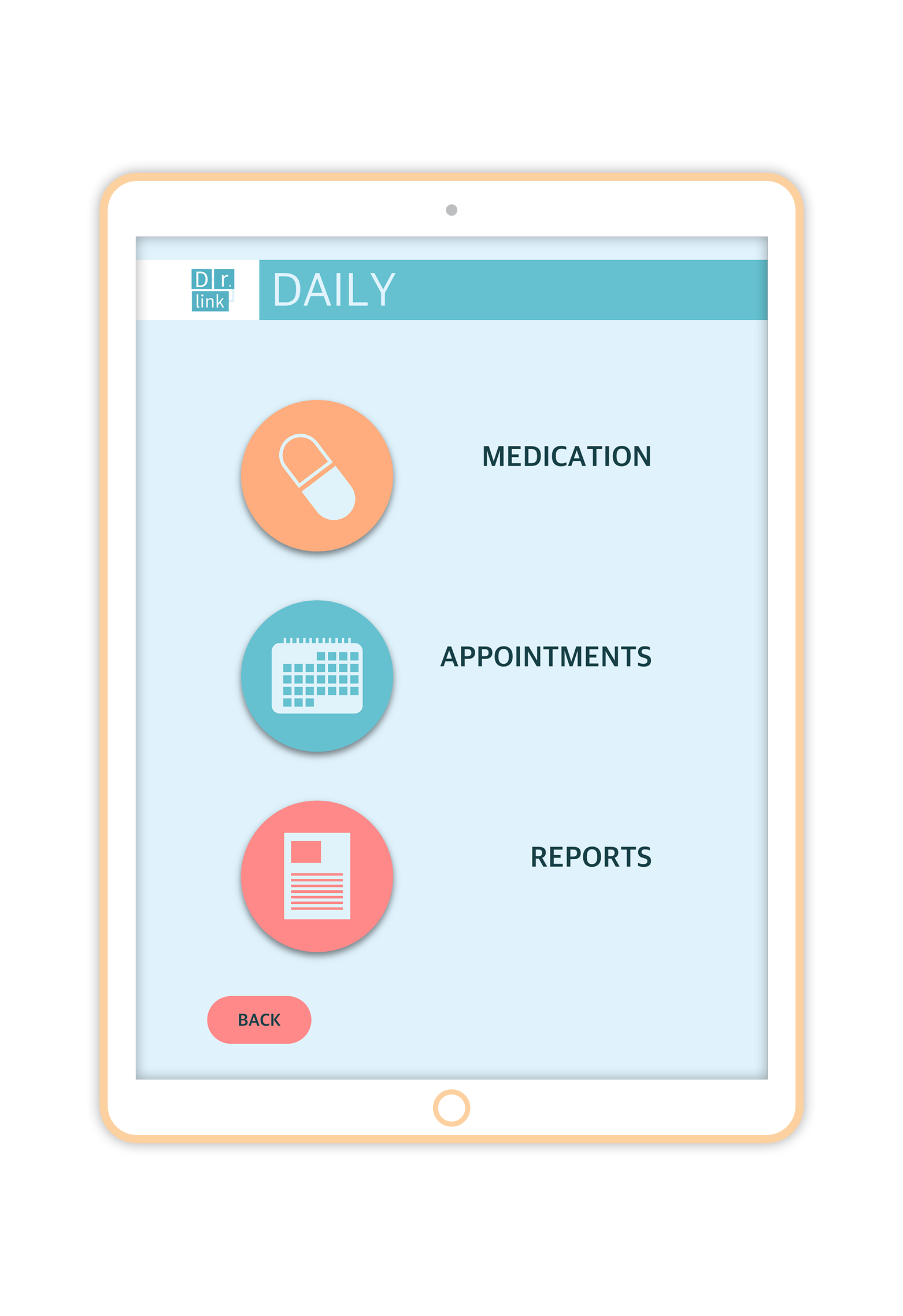
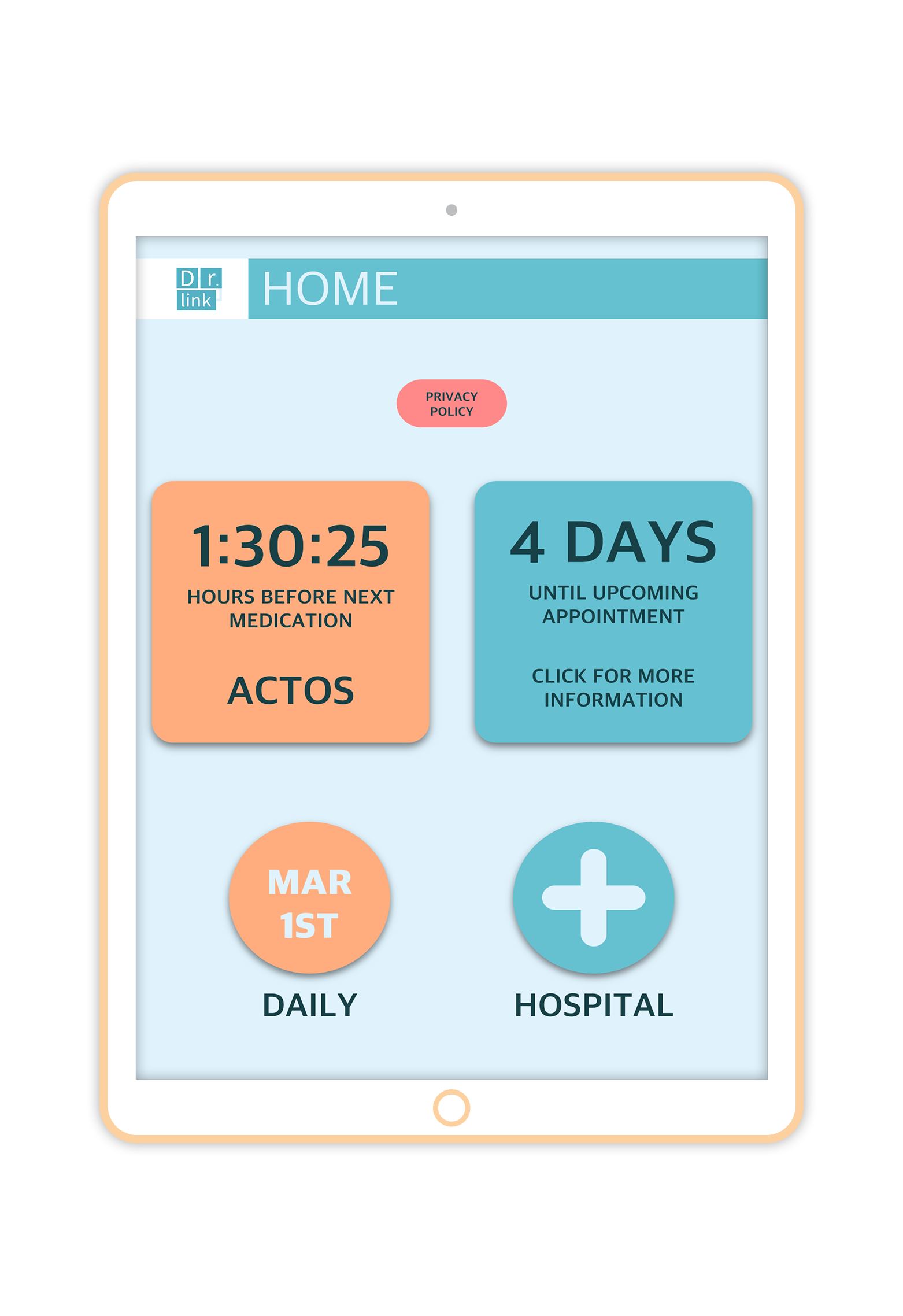
Dr.Link prioritises practicality and functionality to provide the best for all its users. It allows the hospital to share data about the patient’s medication, appointments, and medical reports to both the senior and their family members in an accessible and efficient manner. Different users will have different interfaces to better suit their needs, for example, the seniors’ interface would priorities readability and simplicity, while the family member’s side would prioritise efficiency.
DESIGN PROCESS
User Research
Research shows that seniors prefer high contrast graphics, which enables them to easily read and recognise things. As iconography on digital media is a rather new culture, it is better to provide text on top of icons. Capitalised san-serif fonts with thick, even strokes are also preferred as they have higher visibility compared to serifs with uneven strokes. There is also room in the market for more voice designed products. This is interesting to our project because it is definitely something we could explore given that our primary users are elders that may not be as sensitive to visual languages as younger generations are.
As for the caretaker side, we understand that they are familiar with technologies and smartphones, therefore knows how to navigate through a more minimalistic interface featuring icons instead of words. This leads to a clean and sleek design for the caretaker interface to promote efficiency.
Precedents & competitors
My Chart


My chart allows patients to be involved in their health maintenance. The interface is clear to understand and relatively simple to our eyes and our age range. We used one of the member’s aunt’s account and asked her questions on what the app allowed her do. There were tiny restrictions such as not being able to see email threads. A user can only communicate one way — they can send a message to a doctor, but not the other way back. This isn't what we are necessarily trying to do.
WebMD


WebMD is another application that we looked into, as it provides users with interactive interface that could easily let them help themselves identify the symptoms. Although symptom checker is WebMD’s primary function, it also includes other useful
User Scenario
Nikolas Spalding is a 75 year old diabetes patient that lives with his spouse in Brooklyn. Spalding’s daughter, Maria, usually visits them once per week, but due to the increased workload she can barely make enough time to visit and take care of her parents.
During a regulatory checkup visit to the hospital, the staff told Maria that she can download the app “Dr.Link” for Spalding and herself, which can provide both parties information on medication and reports, along with future scheduling. Maria downloads the app for her parents and herself, and made sure that it’s connected with the hospital during setup.
Despite Maria’s busy schedule, she is able to keep track of her father’s medication intake and medical reports. She is also able to remind her father to eat medicine as the app notifies both the daughter and the elder before and after the medication intake time.
Needs:
Maria: Work to pay bill, take care of parents, socialise, take care of self
Nikolas: Take care of health, remember to take medicine, be on time to appointments
Goals:
Maria: Spend more time with family, be more aware of parents’ health situation
Nikolas: Learn more about tech, connect with daughter more, make sure he doesn’t miss any medication or appointments
Pain points:
Maria: Needs to work long hours, barely enough time to visit/take care of parents
Nikolas: Forgetful, easily confused by new technologies, overwhelmed with
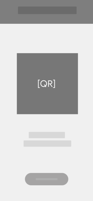
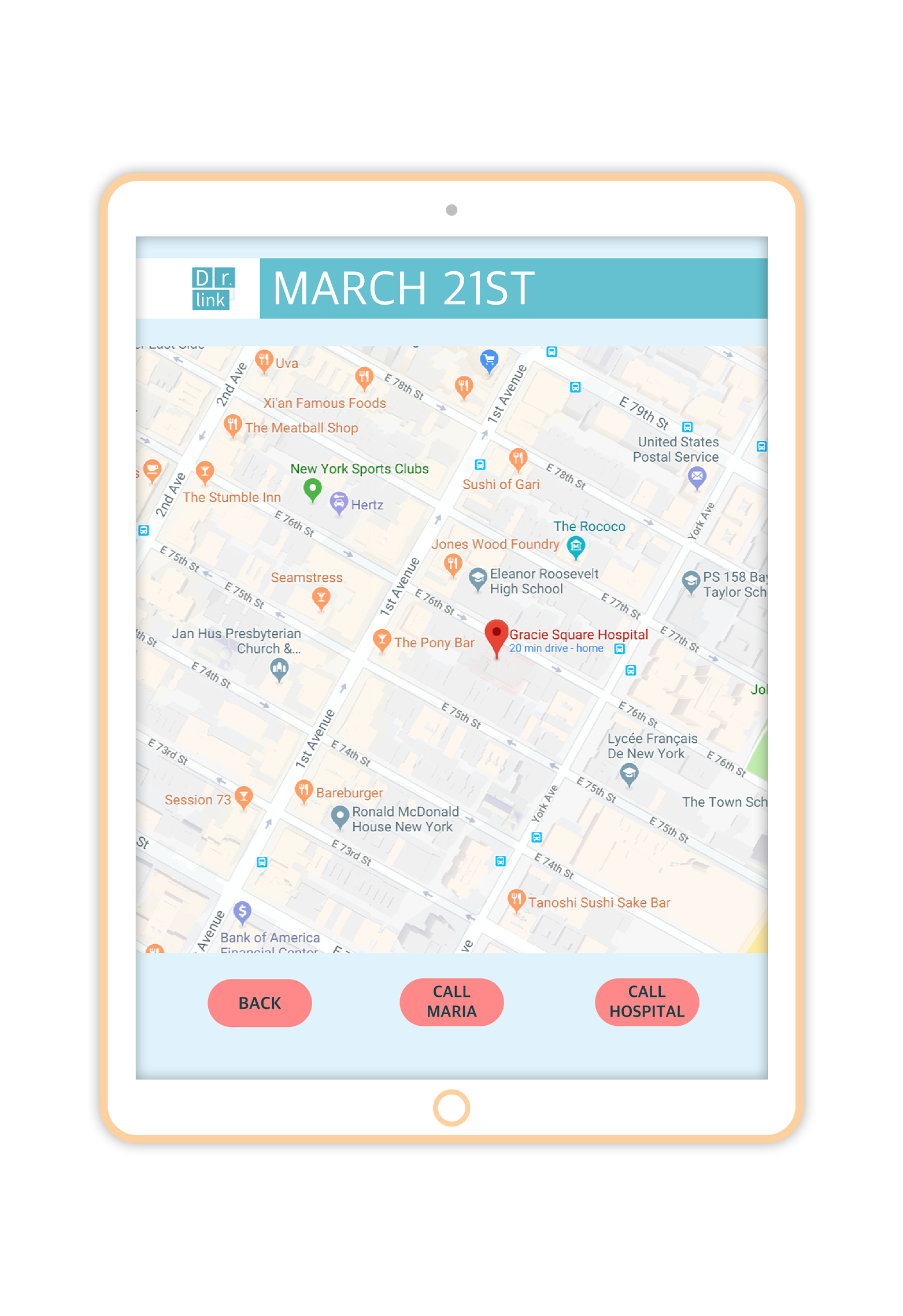
Dr.Link has made Maria’s life more convenient and allowed her to learn more about her father’s health, it also allowed Nikolas and his wife to look through future schedule and medical reports. Dr.Link would also make it easier if Nikolas were to visit the hospital himself, as the QR code from the app provides the hospital staff with Nikolas’ medical information.
PROTOTYPING
Userflow

Wireframe


User testing
Our prototype was tested on users whose age ranged from 16-66. Most users enjoyed the interface and agreed with the concept. One observation noted was that the older the user, the more comments they gave. Family members were impressed with the concept and understood the concept as they reflected on their own family members ageing. One user suggested integrating Dr. Link with more applications. Another user wanted more information on the elder — and suggested location tracker along with biofeedback from a fitbit or other device.


Grandma 66
Red is a good colour
Fonts are easy to see
Clear distinctions between contents
Thinks she doesn't need help
Did not understand any of the icons used
Don't use acronyms or shortened words
Tony 44
Wanted to have more control
See location & activity of elderly
Thinks it works for elderly to enter their own information
should see option for who you are monitoring
wants to send reminder
Sandra 24
Sees good in simplicity
Doesn’t think too much communication from the Dr. is necessary
Only wants click interactions
Wants to see option to cancel appointment
Peter 16
Too simple
Icons are clear
Doesn’t think it requires additional function
TAKEAWAY AND ITERATIONS
Iteration
Based on our researches and user testing, we decided to make completely different user interfaces for family members (younger generation) and the senior to fulfil both their demands. Generally, family members wish to have more control/information over the senior’s medical problems. Active location, daily medicine consumption, and fitbit activity could be convenient features in the family app, while the elder interface would require an even simpler and clearer structure.

Usertesting II
We made an appointment to visit one of the local institution that teaches seniors how to use technology. It was the perfect opportunity for us to conduct user testing as the demographics fits our product well. We received various feedback from the seniors ranging from possible visual changes, navigations, adaptability, and accessibility. Overall it was a well received project and we were able to collect much more advices and comments to prepare for our final product.
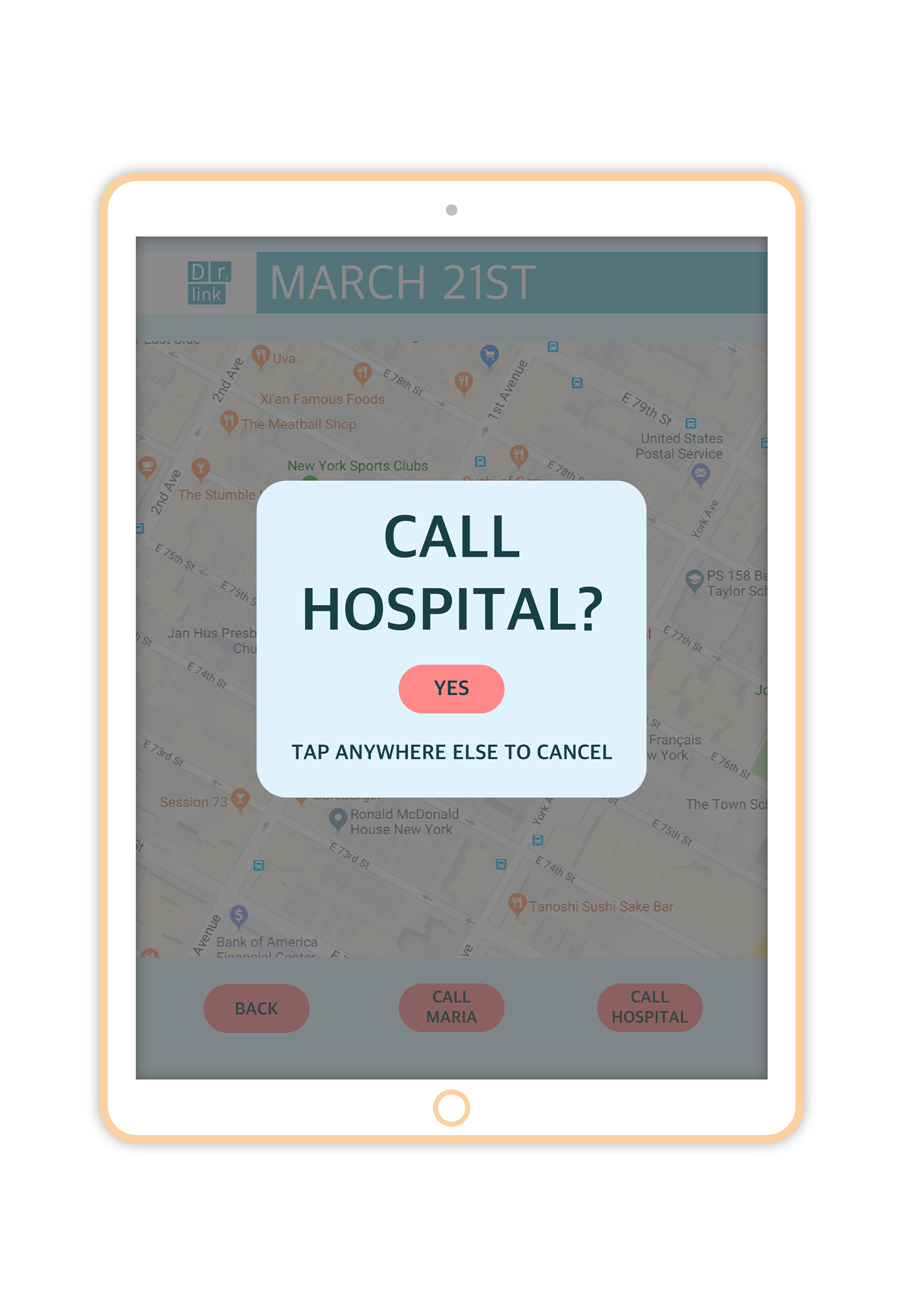
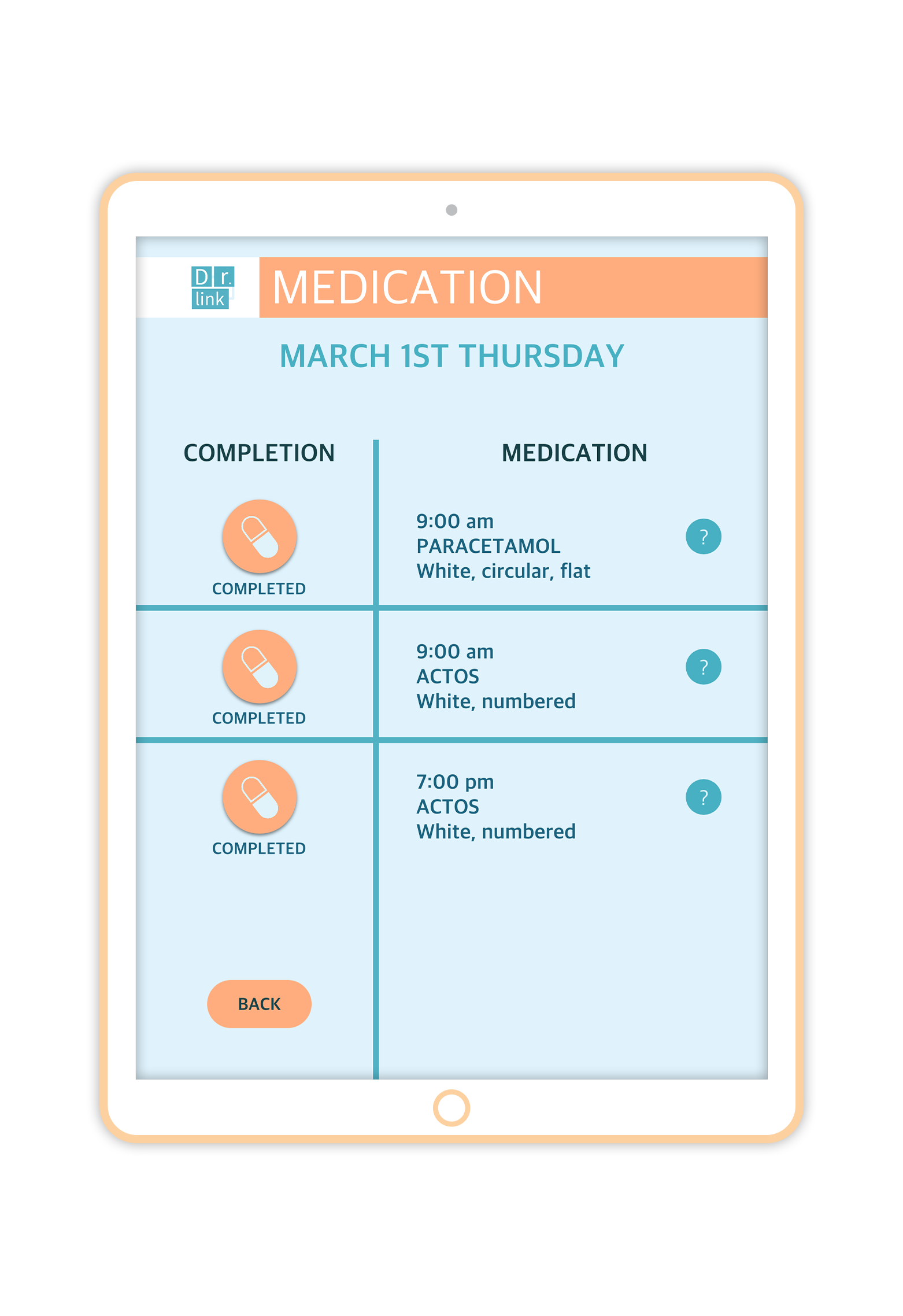
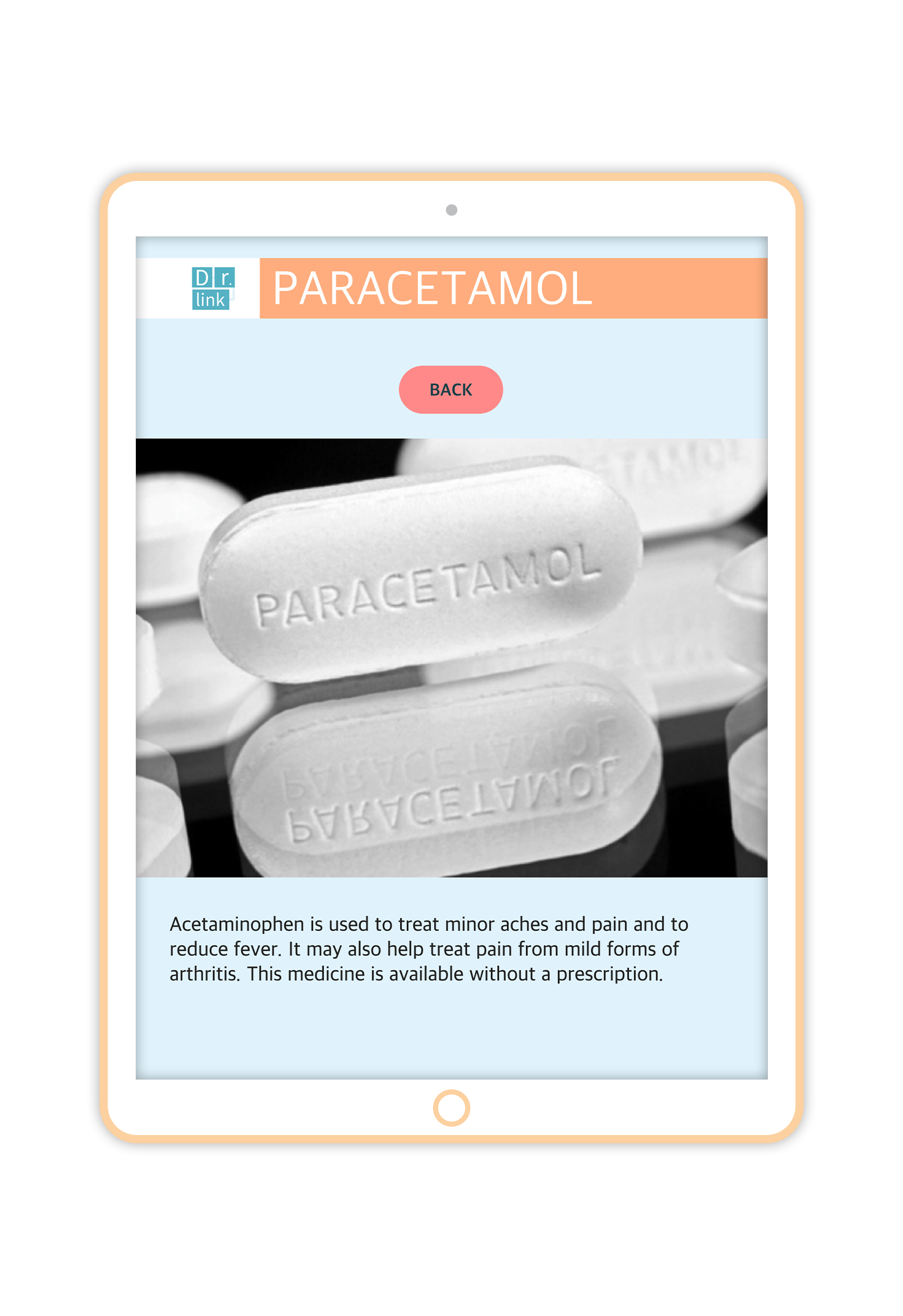
FINAL PROOF OF CONCEPT
Below are some screen shots of the prototype we made for both senior and the caretaker. Feel free to click and look around the different pages of the app! Shoot me an email if you would like to check out the prototype with your phone/iPad.
Senior iPad view
Care taker iPhone view